

Like a picture, a good graph is worth a thousand words (and a bad graph can take a thousand words to clarify). Whether you’re presenting contract volume trends, outside counsel spend, or cycle times, clear and effective visuals are crucial for driving informed decision-making.
While Microsoft Excel is the most common tool for business analytics, its default settings leave a lot to be desired. Applying a few simple design principles can elevate your graphs to a professional level. Here are my top tips for making clean, impactful graphs in Excel.
Eliminate Clutter
Clutter is the enemy of effective communication. Every unnecessary element in a chart increases cognitive load and distracts from the key message.
To streamline your graphs:
Be Intentional with Color
Color is a powerful tool but should be used sparingly and strategically. If you ever find yourself using a default color scheme, stop, and consider these design suggestions:
Use Proper Alignment and Spacing
If you have ever looked at a graph and couldn’t put your finger on why it looked off, it was likely an issue with element alignment. A well-aligned chart improves readability and professionalism.
Consider the following carefully when designing your graph:
Directly Label Data for Clarity
One of the simplest ways to improve a graph is to reduce the need for extra mental exertion to understand the data’s story. To do this:
Focus on Your Message
Graphs should tell a story, not just display numbers. As you write your data story, remember to:
Before & After
Let’s look at these principles in action. Below is a default chart Excel created for the number of contracts negotiated by type across the four most-recent fiscal quarters:
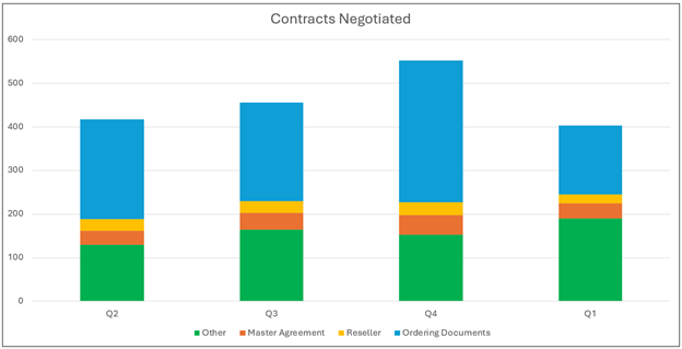
At first glance, this graph looks simple and pretty, but pay attention as you look at it: where do your eyes go? Do they bounce around? Can you easily identify trends or tell what the story is?
Now look at the chart below, which applies many of the principles discussed in this post:
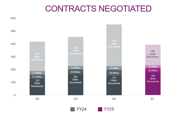
This chart has removed clutter such as the outline and gridlines; instead of a legend, it labels its data directly; and it uses a single accent color to emphasize the most recent quarter’s numbers as the focal point of the graph.
You may notice that this graph doesn’t apply every single design suggestion—and most graphs shouldn’t! Just know the tools in your arsenal so you can make informed, intentional decisions in your design choices.
Now It’s Your Turn
What story is your data telling? Is it clear, concise, and compelling? Or is it more messy, muddled, and unmanageable?
A well-designed graph in Excel can transform raw data into compelling insights. By applying a few design principles, legal operations professionals can create visuals that drive better decision-making. Thoughtful data visualization is not just about aesthetics—it’s about respect for your audience and your data.